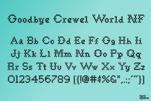
Copasetic Font
by Nick's Fonts
Updated
Art Deco3 font family styles
Regular Style

truetype 165 glyphs 394 characters
NF Regular Style

truetype 200 glyphs 219 characters
NF Bold Style

truetype 209 glyphs 217 characters

Designed by
About Copasetic Font
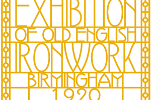
Back in the Olden Days of Graphic Design B.C. (before computers), type freaks used to wait in anxious anticipation for each new release of the Letraset catalog. The inspiration for this font, Premiere Lightline, was one such release, and probably help spur my interest in Deco designs. The original font was VERY light indeed, suitable only for use in large sizes. My version is beefier, and includes an entire lower case of alternate letterforms, making this (at least) two fonts in one. The name is the 40’s hep talk equivalent of “Cool!”
Report Font
Related Styles
Comments

myirie
12 years agoSuch a great font! Thanks!

For those of you looking for an improved version with more/better accents etc: Nick Curtis has allowed me to rework his free fonts and offer them with a (very generous) commercial license.
So if you need a professional quality Unicode OpenType or TrueType version of this font with a multilingual and expanded character set - you will find it here:
http://www.cheapprofonts.com/Copasetic_NF_Pro
(Nick Curtis receives royalties from all sales)